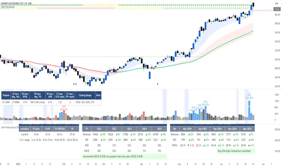
TwP: Financials on ChartsWith this indicator, you can see the following on a chart:
> An Info Panel , with the financial snapshot of the company, such as its market capitalization, annual & quarterly financials, Y/Y growth numbers, profitability margins, RoE & RoCE, and valuation ratios.
> EBITDA and PAT margins over a period of time.
> RoE and RoCE ratios over a period of time.
> Valuation multiples over a period of time.
> A comparison of margins, return ratios, and valuation multiples with any peer-group company .
Info Panel
This gives a quick snapshot of the financials of the company, which includes annual & quarterly Revenue, EBITDA, PAT, margins with Y/Y changes, Debt-Equity ratio, ROE, ROCE, and valuation multiples.
Profitability & Return Ratios
You can view quarterly as well as annual EBITDA & PAT margins and annual RoE, RoCE. You can choose to see these ratios either only for the company or can also add a peer company to compare.
Valuation Ratios
You can view TTM valuation ratios such as EV/Sales, EV/EBITDA, P/BV & P/E multiples. You can choose to see these valuation multiples either only for the company or can also add a peer company to compare.
[i]price

Key price levelsFunction: labelling recent highs and lows automatically. Easy and clean.
In this example, we can see the previous low of the ticker is around 105.5, the previous high is around 120.
We can set up our entries and exits by referring to the last lows and highs.
Users can adjust the searching bar range by themselves.

LotSizeCalc_v1 (EUR)Hey there,
here I like to publish my first TradingView Script for the Indicator "LotSizeCalc" which calculates the LotSize for the currency '€' for e.g. the MT4-App depending on the following parameters:
- Stop Loss in pips (example: 30 pips)
- Account Balance in EUR (example: 500€)
- Risk in % (example: 1%)
It is very similar to the MyFxBook Calculator on their website, where you can compare the results for the lotsize.
You receive the calculated value next to the indicator, and - for mobile device - it also shows a label with the calculated lotsize (which you can deacivate via settings if you like).
The indicator works for the included common foreign Forex pairs (AUD, CAD, CHF, JPY, JPY, GBP, NZD, USD) in order to calculate the risk to a EUR-Trading Account.
Actually, the Script allows in general some adaptations due to your trading system. This one is the most basic version.
Happy pips and I wish you safe and risk-calculated trading!
Marcel :)

Price Continuation (The Strat)Shows the historic bar type, whether it is up, down, up and inside, down and inside, up and outside, or down and outside. Will only display historic bar type based on the selected time timeframe. (Ex. if you are looking at the weekly time frame, you will only see the bar type for Year, Quarter, Month, and Week. It will not display the Day or Hour bar type.)

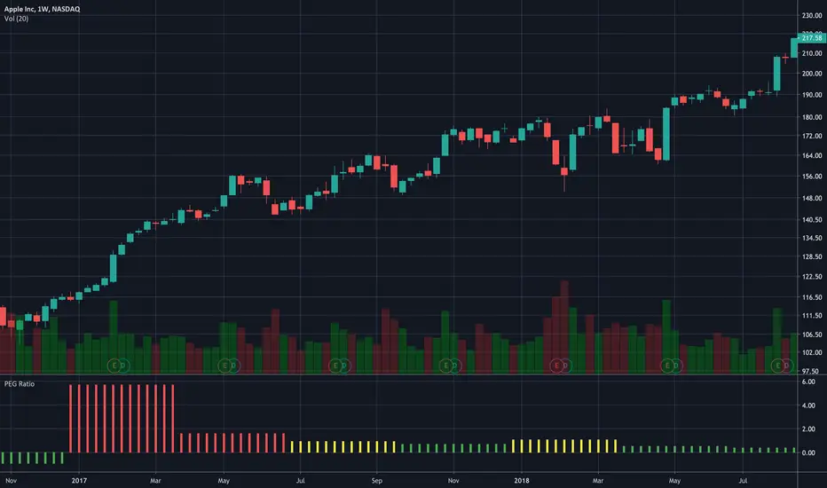
PEG RatioHello everyone,
Quick script to check the PEG Ratio.
What is PEG Ratio?
The price/earnings to growth ratio (PEG Ratio) is a stock's price-to-earnings (P/E) ratio divided by the growth rate of its earnings for a specified time period. The PEG ratio is used to determine a stock's value while also factoring in the company's expected earnings growth, and is thought to provide a more complete picture than the more standard P/E ratio.
A PEG Ratio greater than 1.0 means that the stock is overvalued, while below 1.0 means is is undervalued. When the PEG Ratio is exactly 1.0, then the stock is trading at fair valuation.
Formula:
PEG Ratio = (Price / EPS) / EPS Growth
Examples:
Company A:
Price per share = $46
EPS this year = $2.09
EPS last year = $1.74
Company B
Price per share = $80
EPS this year = $2.67
EPS last year = $1.78
Company A
P/E ratio = $46 / $2.09 = 22
Earnings growth rate = ($2.09 / $1.74) - 1 = 20%
PEG ratio = 22 / 20 = 1.1
Company B
P/E ratio = $80 / $2.67 = 30
Earnings growth rate = ($2.67 / $1.78) - 1 = 50%
PEG ratio = 30 / 50 = 0.6
The company A is overvalued whiled the B is undervalued.
In this script an overvalued stock is considered when the PEG Ratio is above 1.1, while it is 0.9 for an undervalued stock.
Only works with Stocks.
Happy trading,
PROFIT + ALERTS V2This is an Alert indicator for PROFIT + strategy.
Use it with the strategy to create and receive notifications when the strategy generates buy / sell signals.
To get access to the indicator and its strategy pm me.
------------------------------------------------------
Это алерт индикатор для стратегии PROFIT +
для получения уведомлений когда стратегия генерирует buy / sell сигналы.
Для получения доступа к индикатору и стратегии пишите в личные сообщения.

Cuban's Price Action ChannelThe latest in the indicator series tailored to discretionary traders.
This script draws a channel by using the highs and lows of previous timeframes. The H1 and H4 fill is extremely useful for taking low timeframe front-side reversals in a ranging environment, while providing high timeframe levels to take profit at, and plan your next trade.
I believe this script provides a solid fundamental price action understanding and foundation to anyone's discretionary trading setup.

2HH2LL formationPrice action formation like a confirmation to get in to the trade. Based on 3 candles.
2HH formation= High-> higher high-> open above and close below high of the first bar.
2LL formation= Low-> lower low-> open and close above low of the first bar.

Indicator: Price Weight Oscillator [xQT5]This is my revision of AO (Awesome Oscillator) that can give more correct and early signals as on my opinion.
I'm used a original formula of AO and modified it with high and low prices adding.
Enjoy it!

Concept Volume Price Analysis (VPA)Highlighting possible reversals, continuation, etc based on price action and volume analysis.

Example - How to create multiple level gridsExample on how to create custom grids with variable N lines/labels:

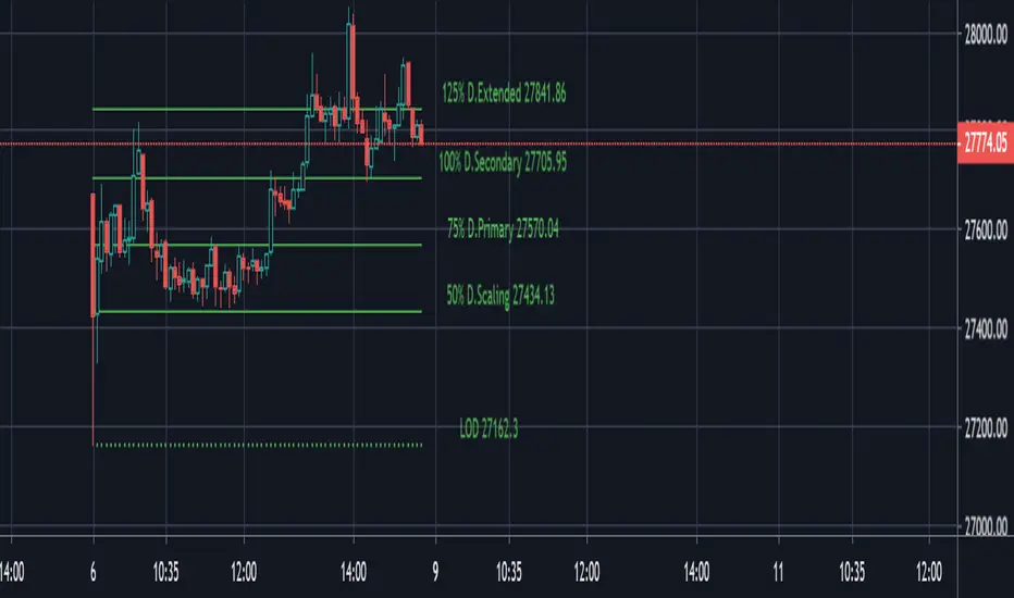
PivotBoss ADR Price TargetsThis script forcasts daily, weekly, Monthly targets well in advance so that you can position yourself accordingly. Script has four target levels such as 50% target level, 75% target level, 100% target level and 125% target level. You can scale out your position across these levels. Price has 80% potential to reach 1st target level, 70% potential to reach 2nd second target level and 50% potential to reach 3rd and 4th target level.
The script takes 10 period average daily range and high of the period to project the downside targets, 10 period ADR and low of the peiod to project upsdie target levels.
When the price is trades in the narrow range in the prior period then the potehtial to reach 125% target level increase by 90%.
This script is purely price based use it with other pivotBoss pivots and volume profile for confirmation of your bias
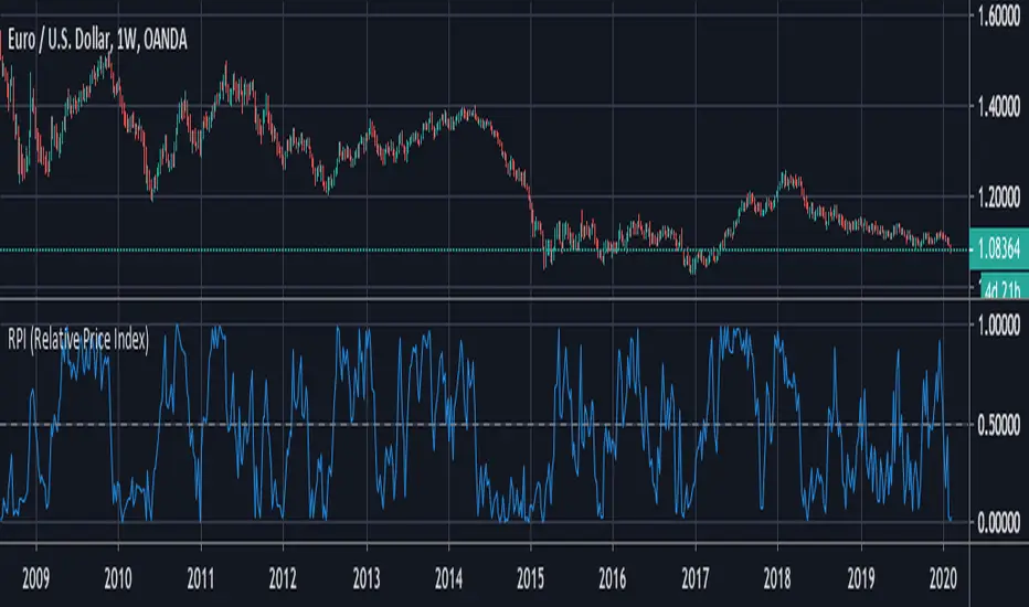
RPI (Relative Price Index)This is a free indicator created by Stormpike Group that displays the relative price of an underlying for the given period.
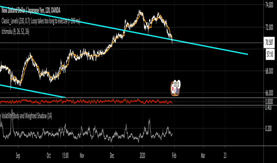
Volatility (Body and Weighted Shadow)- Volatility Indicator
- Replacement for ATR
- As each pair holds a different level of volatility, a stop loss can be set using this indicator rather than via a ratio 2:1, etc. e.g. 2 X Volatility Value = S/L...
- This indicator averages the bodies of candlesticks over a default length of 14 periods. It also considers the length of shadows via a weighted average. This is done as it is assumed that financial institutions tend to move price to levels that do not hold (shadows). Therefore, wick lengths are less significant than the candlestick bodies, so they are weighted to hold less value.
Shadow MAShadow/Wick Moving Average
- Moving Average comparing top and bottom Shadow / Wick length
- Shadows represent price levels that have been hit, but did not close
- Not an all-purpose, all-in-one indicator for entry and exit
- Used as a visual aid to better understand price movement. For example. if price is bearish, but the Shadow MA is showing high, positive values, it is a sign that price is not tending to close at its highest point; therefore, there is bearish resistance.
- Can be used in combination with momentum oscillators and trend analysis.

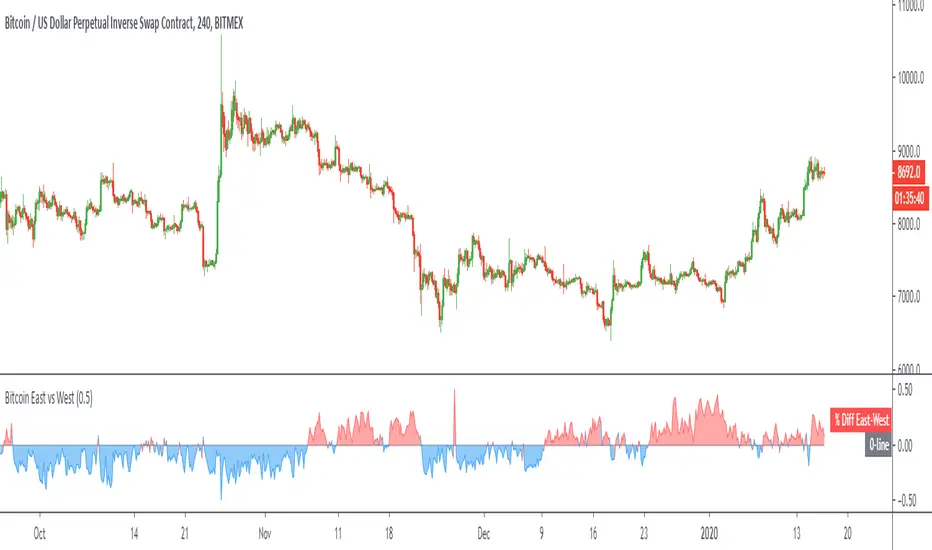
Bitcoin East vs WestPlots the volume weighted price difference between the top spot exchanges in the "East" (Asian markets) versus the "West" (US/UK/EU markets).
Optional: view the volume difference between the two.
Megalodon Pro Advance Data CalculatorIt is designed to combine price, volume and indicator data from different brokers/exchanges. This helps us to have a more accurate data, so that we can have a better picture of the price/volume/indicators.
Features
It may combine up to 18 different data sources.
It can print indicators such as MFI, RSI, OBV, BB, Williams%R. If you have any suggestions, write them in the comment section below.
Usage
Just select the data points you would like to combine in the setting to view price, volume or indicators data.
Settings
Setting 1 defines the source you would like to use to view Only Price information.
Setting 2 defines the indicator you would like to print. OnlyPrice is the default setting which views the source information defined.
Setting 3 defines the length for RSI.
Setting 4 defines the length for MFI.
Setting 5 defines the length for Bollinger Band(BB).
Setting 6 defines the Bollinger Bands' standard deviation.
Setting 7 defines the length for Williams%R.
I hope you will find some VALUE $
~Bo
Enlightening the modern investors
Bitcoin Halving CountdownHello traders,
I offer you today the BTC halving countdown updated in real-time on your charts
I inspired myself greatly from the gentleman @everget's script LTC halving countdown below
(
The countdown date is coming from that source www.bitcoinblockhalf.com.
The halving date is estimated to be around May 13th, 2020 .
That date is hardcoded in the script and is used for the countdown calculation.
The Bitcoin block mining reward halves every 210,000 blocks, the coin reward will decrease from 12.5 to 6.25 coins.
Enjoy the weekend
Dave

PVT Osc - Price Volume Trend Oscillator [UTS]The oscillator version of the Price Volume Trend indicator (PVT) can be considered as a leading indicator of future price movements. The PVT Indicator is similar to the On Balance Volume indicator as it is also used to measure the strength of a trend.
The difference between the OBV and the PVT is that where the OBV adds all volumes when price achieves higher daily closes and subtracts them when price registers a lower daily close, the PVT adds or subtracts only a portion of the volume from the cumulative total in relation to a percentage change in price.
The general market consensus is that this difference enables the PVT to more accurately represent money flow volumes in and out of a stock or commodity.
The PVT has been designed so that it is capable of forecasting directional changes in price. For instance, if the price of a stock is rising and the PVT begins to fall, then this is indicative that a price reversal could occur very soon.
The general consensus is that the PVT is more accurate at detecting new trading opportunities than the OBV because of the differences in their construction. The OBV is designed so that it adds the same amount of volume whether the price closes upwards by just a small fraction or by multiples of its day opening value. On the other hand, the PVT adds volume proportional to the amount the price closed higher.
General Usage
Plain old PVT can be used to confirm trends, as well as spot possible trading signals due to divergences.
A benefit of the oscillator version is that it can produce LONG or SHORT signals on zero line cross.
Or controversy, disallow LONG trades in bearish territory and disallow SHORT trades in bullish territory.
Moving Averages
4 different Moving Averages are available:
EMA (Exponential Moving Average)
SMA (Simple Moving Average)
VWMA (Volume Weighted Moving Average)
WMA (Weighted Moving Average)

MFI - Money Flow Index [UTS]Money Flow Index (MFI) is the technical indicator, which indicates the rate at which money is invested into a security and then withdrawn from it.
Construction and interpretation of the indicator is similar to Relative Strength Index with the only difference that volume is important to MFI.
Usage:
When analyzing the money flow index one needs to take into consideration the following points:
divergences between the indicator and price movement. If prices grow while MFI falls (or vice versa), there is a great probability of a price turn;
Money Flow Index value, which is over 80 or under 20, signals correspondingly of a potential peak or bottom of the market.
Common known variants of this type of indicator are the On Balance Volume, Chaikin Oscillator or Chaikin Money Flow.
Based on www.metatrader5.com

Volume PowerVolume Power
Volume Power is a technique that uses the PVT(Price - Volume - Time ) Distribution algorithm .
*** Features
* Pump or Dump Detection .
* Explosive move Detection .
* Better understanding to each candle than normal Price and Volume .
*** Colors Info
* Blue - No effect to the market .
* Green - Pump or Dump Detection .
* Orange - Average Market ( Can affect the market Trend ) .
* Red - Explosive Market ( Can affect the market Trend and Mostly a Potential Reversal ) .
*** Usage
* Red and Orange can be used for Potential Breakout Candles and Reversals .
Green can be used as Pump or Dump Detection that will help you with your stops and high Volatility detection before it happens as leading indicator .

BTC Mining Cost - IndicatorBTC Mining Cost Indicator
- Adjust the Emission Rate after each halving, currently it's 12.5
- Current settings are for the Antminer S17 with an average cost of 12 cents per kWh
As you can see, a bounce usually follows when the price hits the cost of mining 1 BTC .
I would love to hear your feedback, and if you like it please gimme a thumbs up ❤️
Happy Trading!
